Customization & Branding
Every bike shop has its own identity, and your storefront should reflect that. Storefront is designed to adapt to your brand without sacrificing structure, performance, or maintainability.
Flexible Visual Design
Storefront supports flexible layouts, color systems, typography, and visual components that allow each shop to look distinct while staying within a proven, high-performance framework.
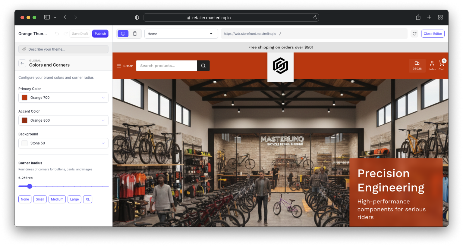
Color Systems
Define primary, accent, navigation, and background colors. Text automatically adjusts for accessibility—light on dark, dark on light—meeting WCAG standards.
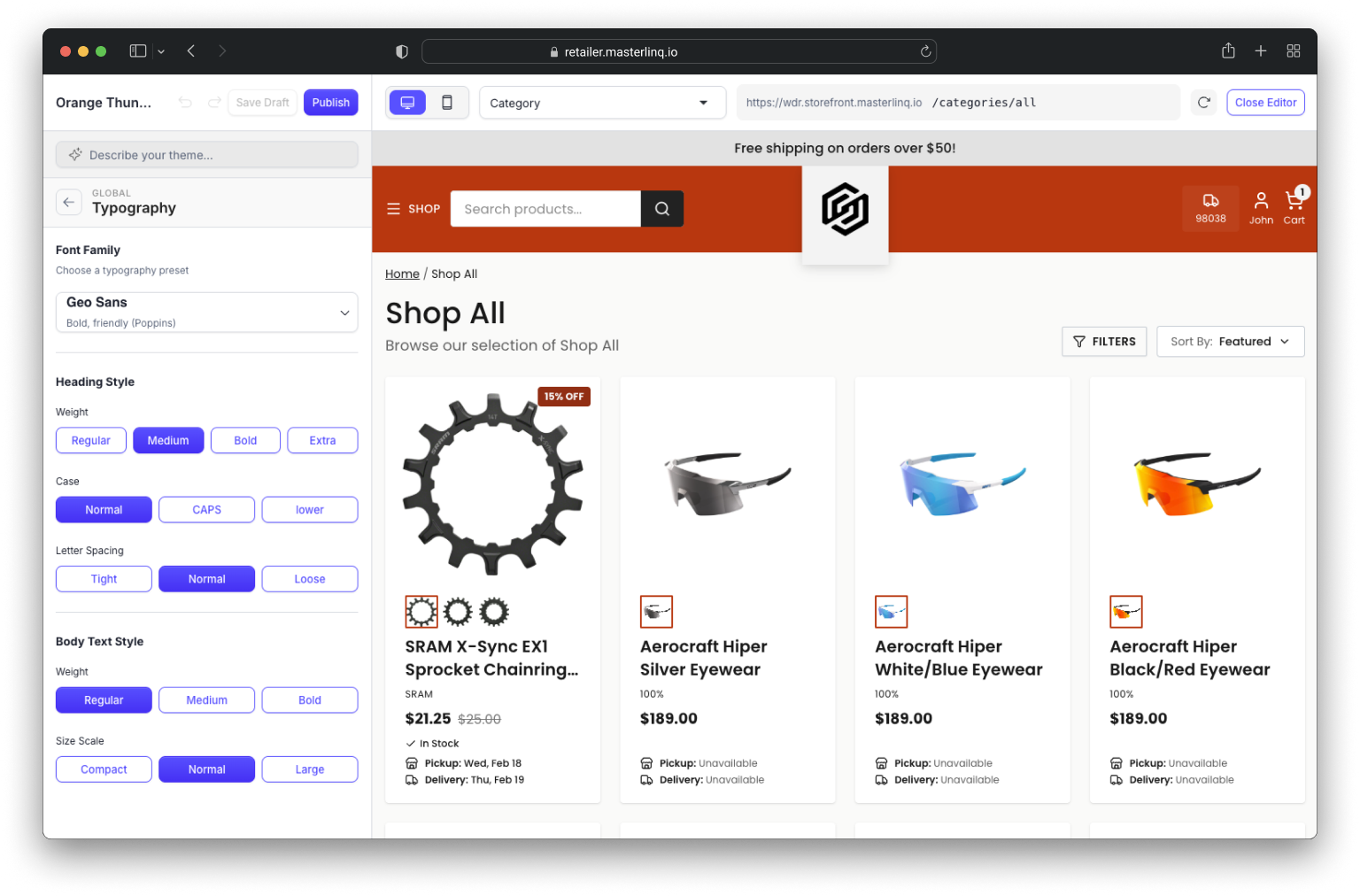
Typography
Choose from Inter, Poppins, Source Sans, Playfair Display, or Work Sans. Control heading weight, letter spacing, and text scale across the entire storefront.
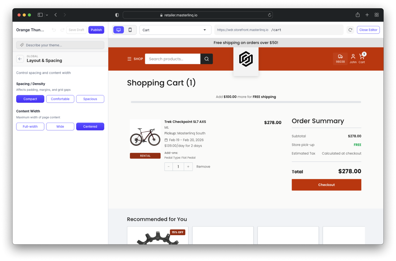
Flexible Layouts
Set density (compact, comfortable, spacious) and content width (full, wide, centered). Global border radius and spacing adjust automatically.
Page-Level
Control
Cards, buttons, forms, and navigation elements are designed to look distinct while maintaining a cohesive, high-performance framework.
Header & Navigation
The header is the first thing customers see. Storefront offers deep customization without code—choose layouts, configure your logo, build mega menus, and style your search bar.
4 Header Layouts
Classic, Logo Center, Minimal, or Double Bar—each with unique options for logo, search, and navigation placement.
Logo Flexibility
Upload full logo, mark+text, or text-only. Mobile can use a different treatment. Light and dark mode variants supported.
Mega Menus
Build nested navigation with unlimited items. Drag to reorder. Mobile navigation adapts automatically with slide-out drawers.
Search Styling
Attached, detached, or collapsed search bar. Custom placeholder text, button styling, and icon options.
Design Without Code
Storefront's theme editor gives you full control over your site's look and feel. Adjust colors, typography, layouts, and page structure through a visual interface — no developer needed.
Full Visual Control
Colors, fonts, spacing, borders, and shadows — adjust every detail of your site through a visual editor. No code required.
Live Preview
See changes instantly as you make them. Test across pages and breakpoints without affecting your live site.
Flexible Layouts
Rearrange sections, swap components, and build pages that match how your shop works — not how a template was designed.
Draft & Publish
Save work in progress. Preview before going live. Keep multiple theme variations for seasonal updates.
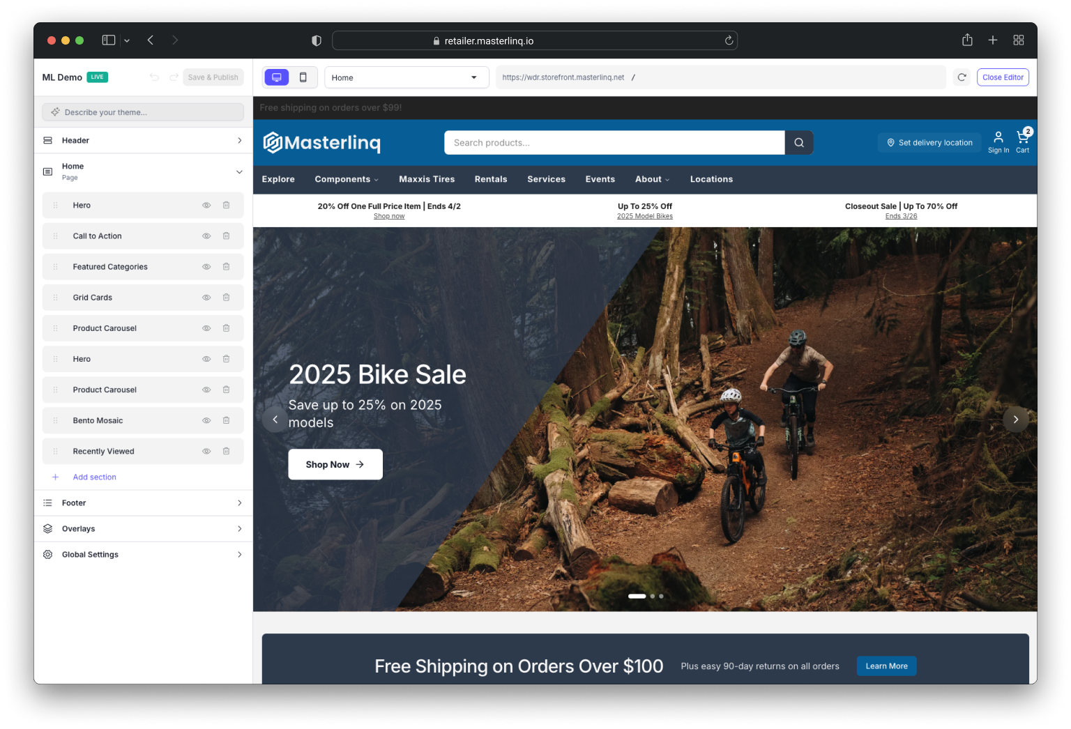
Your Homepage, Your Way
Build your homepage with a full page builder—16 section types including hero carousels, product grids, trust badges, and newsletters. Designed to evolve without rebuilds.
Promotions & Messaging
Announcement bars support multiple rotating messages with custom timing. Dynamic text shows free shipping thresholds. Pause on hover for readability.
Category Features
Surface key categories and collections on your homepage to guide customers to what they're looking for.
16 Section Types
Build pages with hero carousels (6 layout styles), product grids, trust badges, newsletters, image banners, and more—all drag and drop.
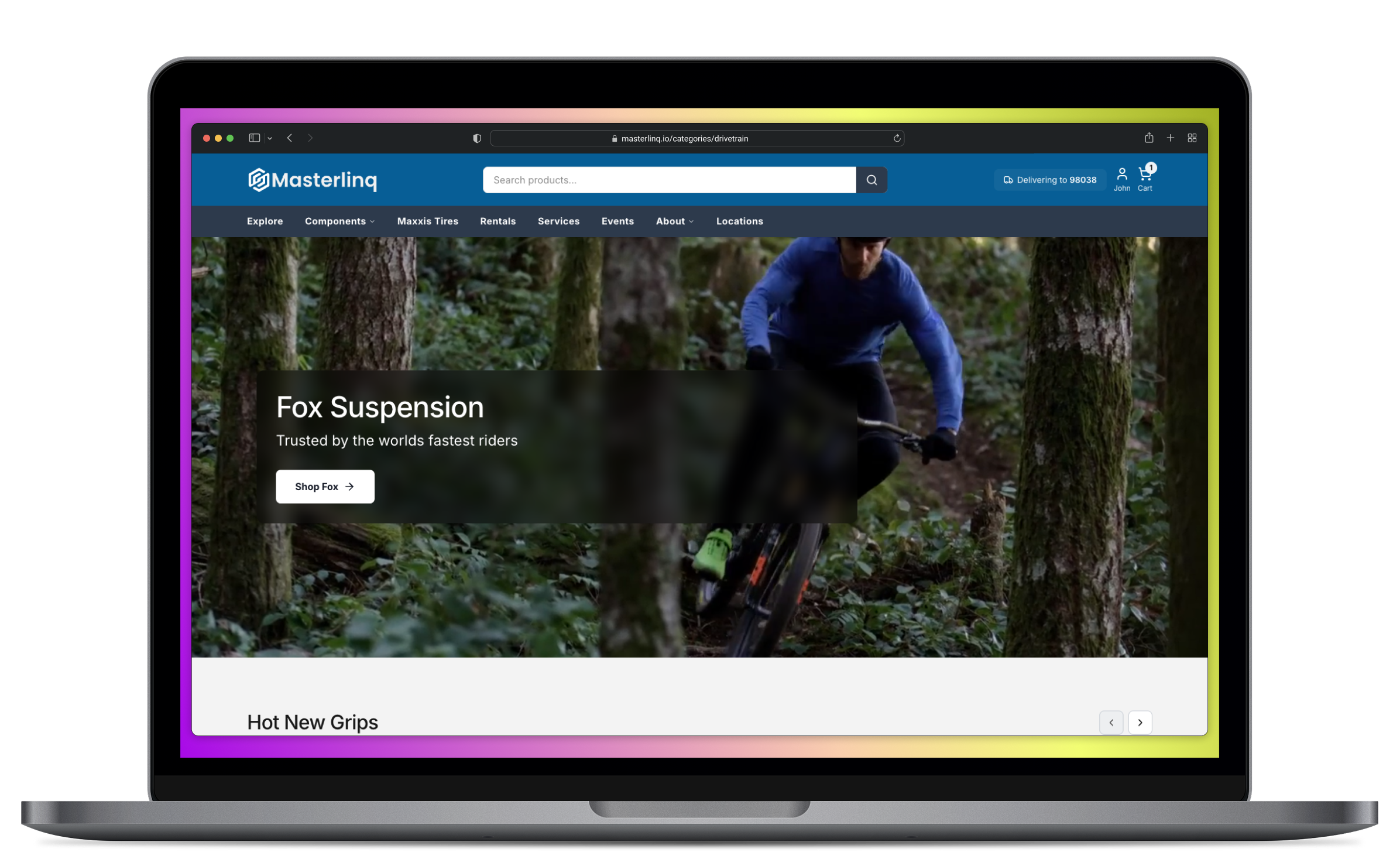
Brand-First Merchandising
Brand presentation isn't limited to logos and colors. Storefront allows retailers to feature key brands, collections, and stories in ways that feel intentional and aligned with how customers shop.
Brand Showcases
Feature key brands with dedicated sections, imagery, and storytelling. Present brands the way they deserve to be seen.
Curated Collections
Group products into collections that make sense for how customers shop—by activity, season, or style.
Brand Stories
Go beyond logos and colors. Share the stories behind the brands you carry and why they matter to your shop.
Consistency Across the Experience
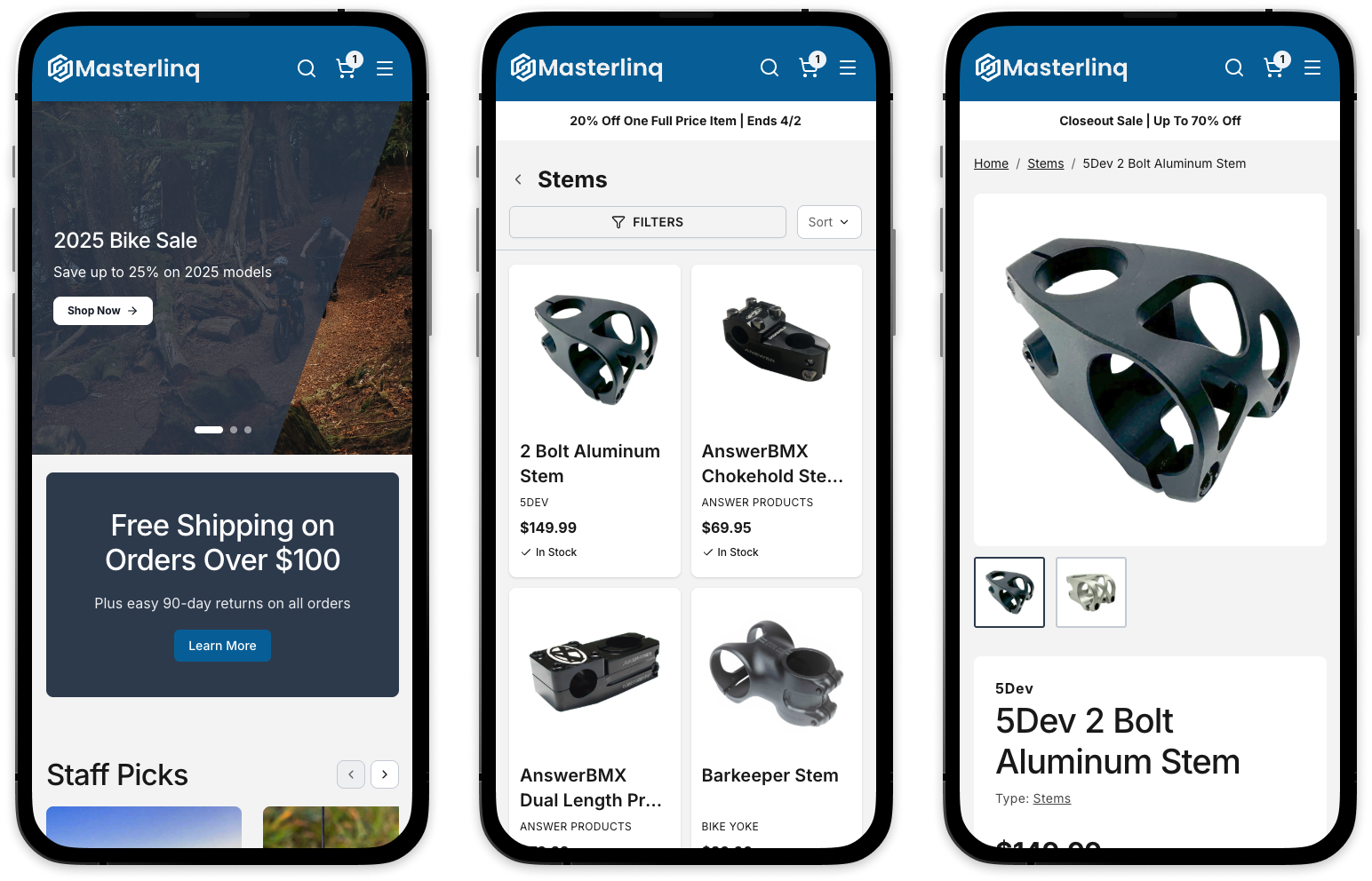
Customization is applied consistently across product pages, cart, checkout, and informational pages. This ensures the experience feels cohesive from first click to completed purchase.
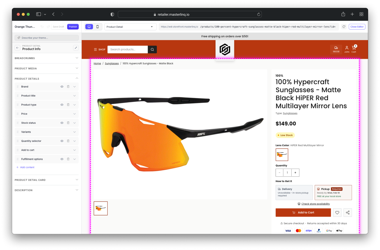
Product Pages
Your brand styling carries through to every product detail page, variant selector, and image gallery.
Cart & Checkout
The cart and checkout experience reflects your brand—no generic payment pages that feel disconnected.
Footer & Policies
Footer styling matches your brand—colors, navigation, payment icons, and social links all configurable.
Built to Evolve
Storefront isn't just designed for each site to be unique — it's built to evolve with your brand over time. Refine layouts, swap content, update messaging, and adjust your aesthetic as your business grows. Save theme variations for seasonal campaigns, preview changes before publishing, and roll out updates without rebuilding from scratch.
Explore More of Storefront
Customization works best when supported by the right connections. Explore how shopping, products, fulfillment, and rentals work together.
Ready to see your brand come to life?
Schedule a demo to explore how Storefront adapts to your shop's unique identity.